
Stop choosing colors by guesswork!
Your home’s palette holds a profound, often subconscious power over your mood, energy, and focus. Learn how to master this emotional language.
This guide will help you move beyond trends to select hues that genuinely support your well-being and transform your living space into a true emotional support system.
Understanding Inner Design: Your Home and Your Brain in Conversation
At the heart of my approach is Inner Design, the understanding that your home is not just a collection of objects, but a powerful extension of your mind and nervous system.
Every color, texture, and layout choice influences your brain’s chemistry and, in turn, your emotions, productivity, and sense of peace.
When we talk about how a color makes you “feel,” we’re touching on this deep, scientific connection. By intentionally designing your space, you’re not just decorating; you’re calibrating your environment to support your mental well-being, reduce stress, and cultivate the feelings you desire in your daily life.
Navigating Color Trends vs. Personal Resonance
Every year, leading paint brands curate their “colors of the year” for interior design, often showcasing beautiful and calming hues.
While these selections, like Benjamin Moore‘s October Mist or Sherwin-Williams‘ Evergreen Fog (from 2022, as examples), offer wonderful inspiration and reflect current aesthetics, it’s crucial to remember that they are ideas of what’s fashionable, not a strict rule.
Your home’s color palette should ultimately be a reflection of your desired feelings and personal story, not just a passing trend.
The Foundation: Basic Recommendationsfor Choosing Your Palette
When selecting colors for your home, the most helpful starting point is to identify how you want to feel and what kind of energy you’d like to cultivate in that specific space.
- For Warmth and Coziness: If you live in a colder climate or simply desire a deeply comfortable and inviting atmosphere, consider warm tones. These include rich shades of red, orange, yellow, and brown, known for their ability to create a sense of intimacy and warmth.
- For Freshness and Calm: In warmer regions, or if your aim is a fresh, cooling, and serene environment, consider cool tones. These encompass hues of blue, green, and violet, which intrinsically produce a feeling of openness and tranquility.
While these foundational guidelines are helpful, truly harnessing the power of color means understanding the nuanced sensations each can bring.
For that reason, I’ve prepared a more detailed list exploring the emotional and psychological impacts of specific colors when used in your spaces:
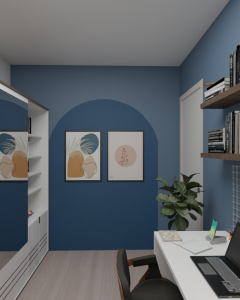
Blue:
Associations: Loyalty, respect, responsibility, calm, serenity.
Emotional Impact: When mixed with green, blue actively helps to relieve stress and tension. It’s an excellent choice for workspaces, as it fosters calm communication and promotes focus.
Tonal Nuances: Pastel blues can significantly enhance a room’s sense of calm and visually expand the space by reflecting ample light, making them perfect for bedrooms and relaxation areas. Darker, grayish tones can induce introspection. However, caution is advised with excessive use of very dark blues, as they can sometimes evoke feelings of sadness.
Violet and purple:
Associations: Sensitivity, intuition, spirituality, sophistication, perception, and creativity.
 Emotional Impact: Violet shades are known to stimulate the artistic side of people. However, strong, intense hues should be used judiciously as they can, in some cases, induce feelings of depression. Dark and rich shades of violet can create an atmosphere of refuge and deep introspection.
Tonal Nuances: Lavender is a delicate and calming tone that can subtly help to raise self-esteem. It is highly recommended for closets and bedrooms, bringing a feeling of refreshment and tranquility.
Red:
Associations: Energy, passion, warmth, but also stimulation and intensity.
Emotional Impact: While reds are stimulating, when overused they can create an oppressive, stressful, or irritating environment, and visually reduce the perceived dimensions of a space.
Tonal Nuances: Magenta encourages introspection and can be a catalyst for personal change.
Cherry reds exude elegance and warmth. Softer pink shades convey femininity and can stimulate affection and gentleness.
Orange:
Associations: Intellectuality, warmth, movement, action, socialization, creativity, and fun.
Emotional Impact: Orange tones are particularly effective for stimulating socialization, creativity, and joy. Delicate hues such as peach, apricot, and softer oranges enhance the feeling of well-being and can even speed up reasoning in office or study environments.
Tonal Nuances: Warm tones like terracotta, cinnamon, caramel, and honey are energetic and inviting but can visually reduce the size of rooms if overused.
Yellow:
Associations: Joy, warmth, childhood, wealth, creativity, and intellect.
Emotional Impact: Cream variants are incredibly versatile and can be used in almost any setting to add warmth. Small and dark environments gain significant light with yellow. However, if used extensively with stark white, it can sometimes generate a feeling of insecurity.
It is generally not ideal for bedrooms due to its stimulating effect on brain function.
Tonal Nuances: Gold, bronze, and mustard are vibrant, rich, sophisticated, and elegantly warm colors. Nevertheless, very strong or overwhelming use of these shades can, for some, encourage pessimism or negativity.
Green:
Associations: Balance, harmony, honesty, stability, reliability, charity, compassion, and hope.
Emotional Impact: Often considered a color that “lowers blood pressure,” green is profoundly comforting and anti-stress, uniquely stimulating silence and deep relaxation. It cultivates a sense of tranquility.
Tonal Nuances: Pastel tones are excellent choices for spaces dedicated to relaxation, waiting areas, study nooks, and meeting rooms, further enhancing feelings of serenity.
It’s All About What You Want to Feel

This post was written to help you understand the profound emotional impact of color.
Choosing paint isn’t just about aesthetics; it’s about how your home supports your mood, focus, and overall well-being every single day.
If you’re ready to dive deeper into transforming your space with intention, or if you’re feeling unsure and would love personalized guidance, I’m here to support you.
My work goes beyond just making things look pretty; it’s about helping you feel calm, clear, and truly supported in your environment.
")